

Here are the top 7 fonts that you should avoid using, even if you like them extremely much.
In principle, if you use a font correctly, meaning that you are using it as the font designer created it to use, you cannot go wrong.
But there are plenty of fonts that are overused or that are just hated by people.
Some fonts are even considered to be racist.
So, you really don’t want to use such fonts for your projects, at least if you don’t want to trigger negative emotions.
Let’s start.
Top 7 fonts that you should avoid using
Of course, that the top 7 fonts that you should avoid using starts with the famous Comic Sans. 🙂
Comic Sans
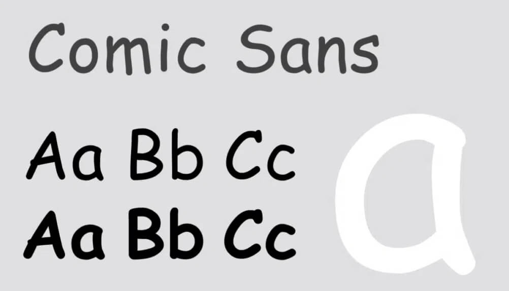
When you look at Comic Sans you see a childish font that you can easily use for kindergartens, toy shops, and other such places.
The main issue of Comic Sans is that it looks very unprofessional and people from all parts of the world used it highly incorrect. They used in places in which Comic Sans was a very bad fit.
So, people considered the font wrong, not the fact that it was used incorrectly.
Now people from all over the world got nervous when they see Comic Sans.
Don’t use Comic Sans if you are not 200% sure of what you are doing.
Papyrus
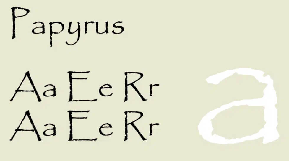
Papyrus font did nothing wrong but it is considered ugly and poor quality.
For sure Papyrus should not be used for professional projects and I think that it should be avoided also for personal projects too.
Helvetica
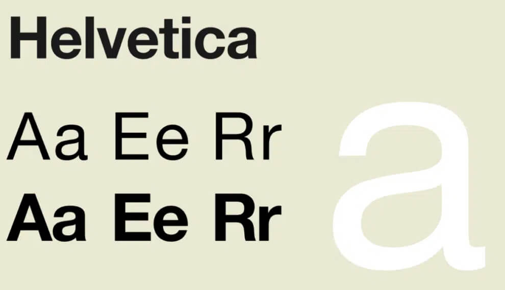
Why is Helvetica in the top 10 fonts that you should avoid using article?
Helvetica is a gorgeous sans-serif font that it is widely used with great success.
I included it here because Helvetica became too familiar and there are much better options out there.
In plus, keep in mind that Helvetica might have some legibility concerns for elderly persons.
Kristen
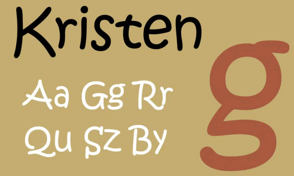
Similar to Comic Sans, Kristen is a very childish font that you should always avoid, especially for professional projects.
Each letter is different and it is quite hard to read.
Scriptina
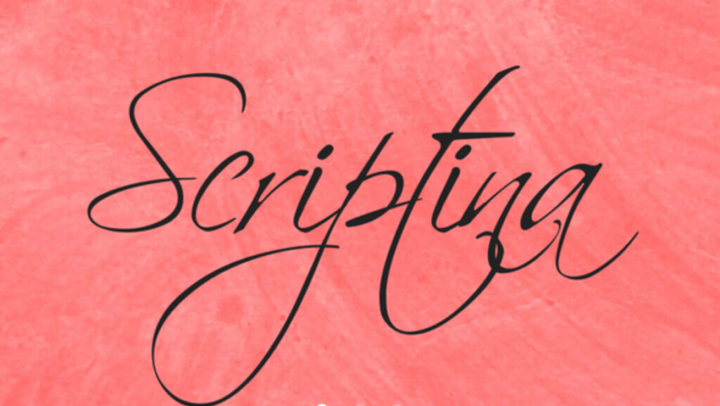
Scriptina is a handwriting font that is way too hard to read, people running away from this font with 300 km/h.
If you will try it for paragraphs, you will see a live nightmare.
Don’t use it.
Fraktur
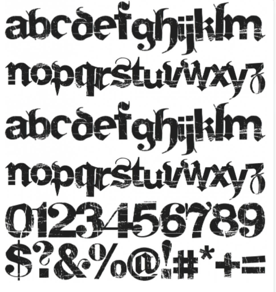
As Wikipedia says: ” The Fraktur typefaces remained in use in Nazi Germany, when they were initially represented as true German script; official Nazi documents and letterheads employed the font, and the cover of Hitler’s Mein Kampf used a hand-drawn version of it.”
Try to avoid using this font if you don’t want trouble.
Name your business white power, use this font, and you will have a hell of a year. 🙂
Hobo
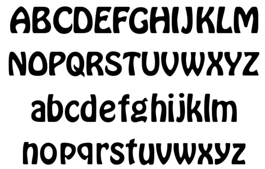
In just a few words, Hobo is a hard-to-read font.
Conclusions
We included here just some of the fonts that you should avoid using.
There are many others that you should avoid, such as:
– Ugly fonts
– Boring designs
– Way too popular fonts
– Impossible or hard to read fonts
– Racist fonts – pay huge attention to such fonts.
Such fonts can make incredible harm to your business. Gothic fonts used in the wrong context can trigger the idea of racist fonts.
When you decide to choose a certain font for your project, best is to search it on the web and see if people consider it ugly, racist, unpopular, bad, etc.
This is the best approach to make sure that you are not using fonts that you should actually avoid.